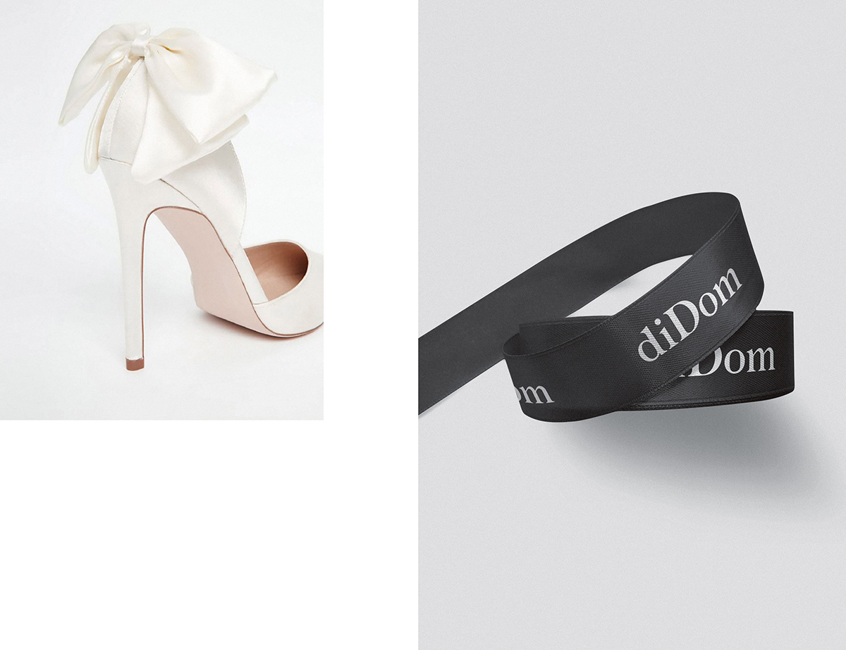
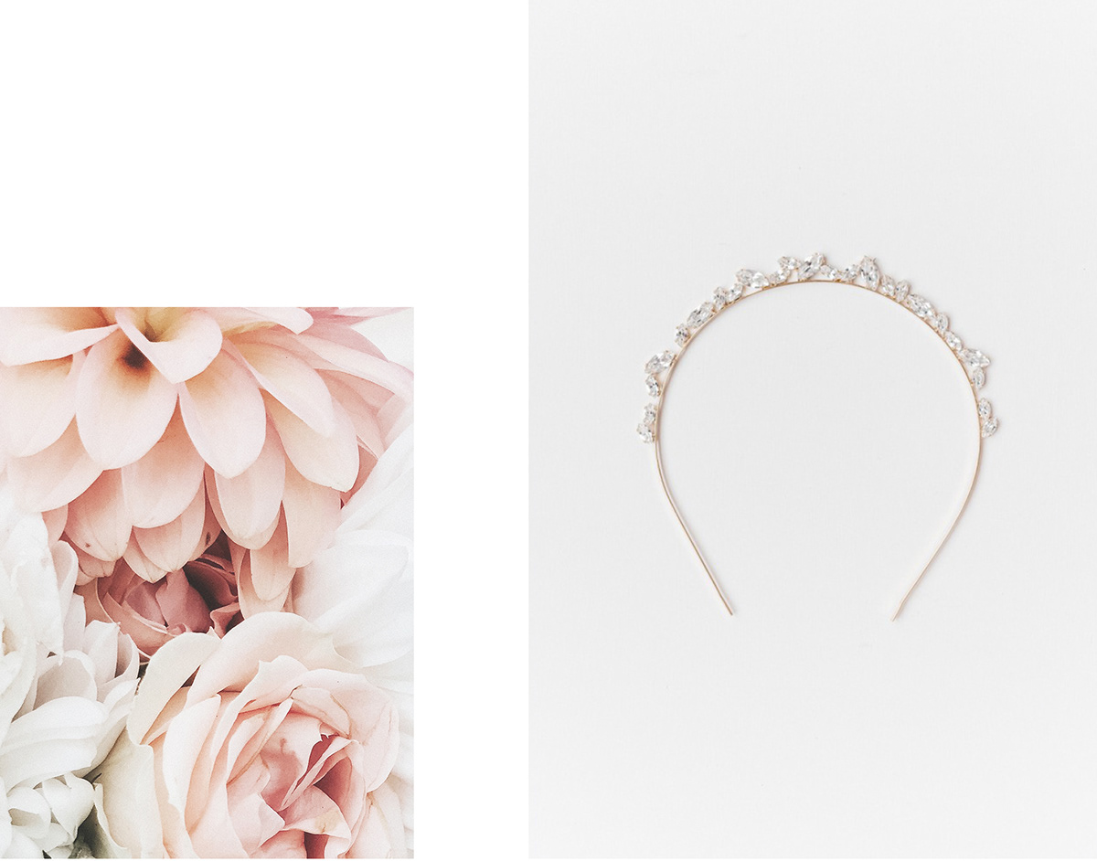
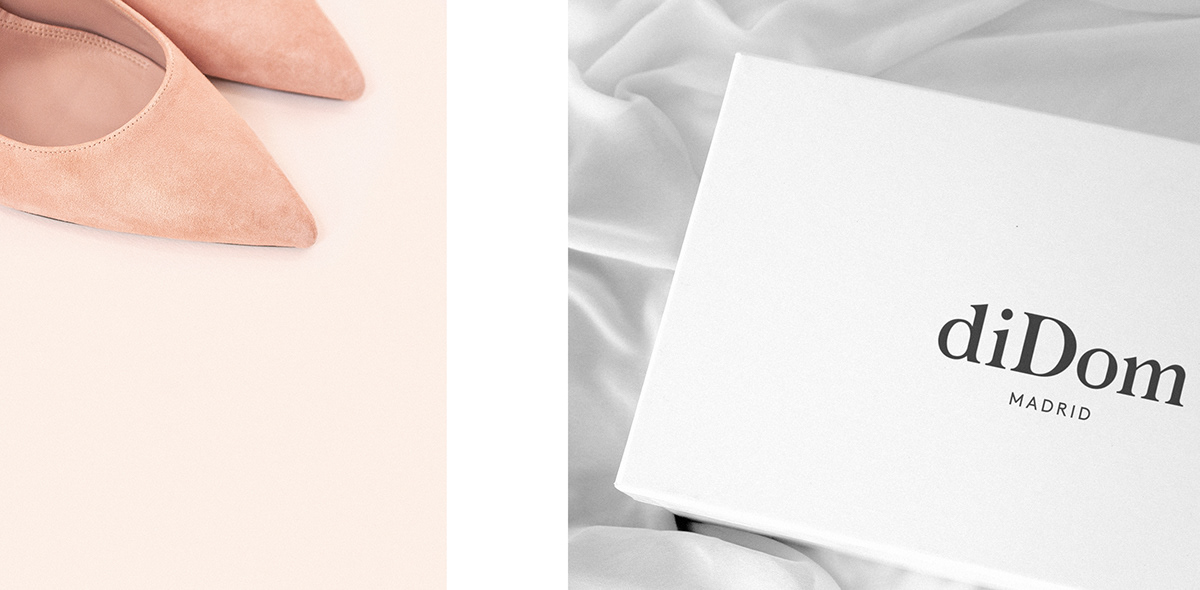
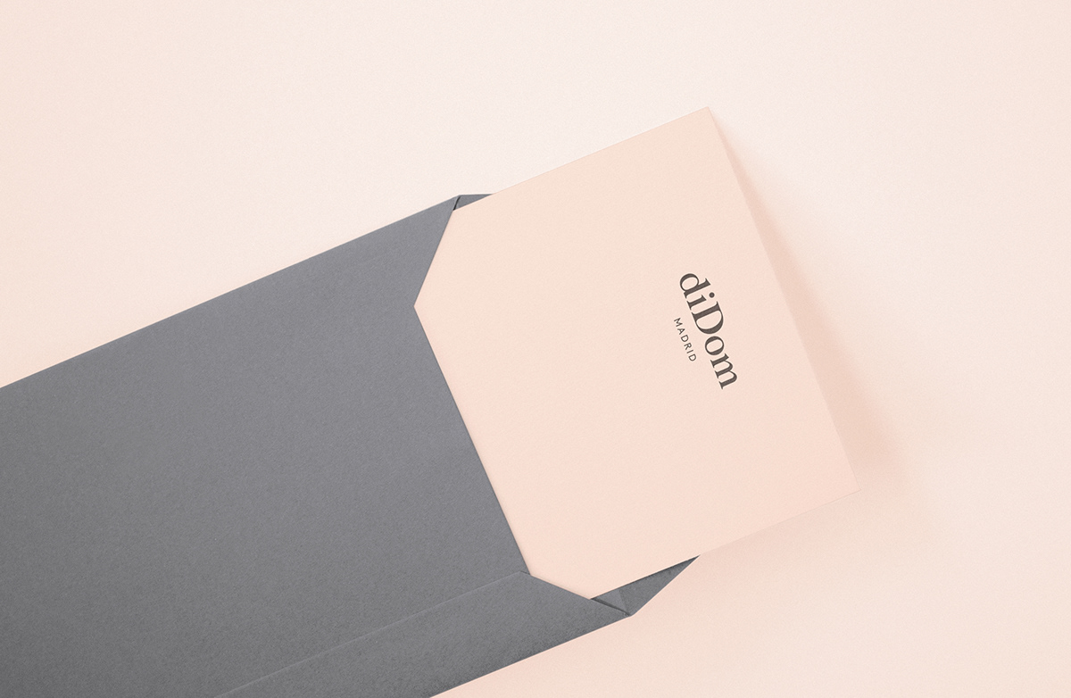
diDom是一家位于马德里黄金地段的中心地带的商店,有30多年的历史,专门销售婚礼和庆祝用的鞋子和配件。我们被要求重新设计整个品牌,以彻底改变其老式形象,并在今天的婚礼市场定位自己。
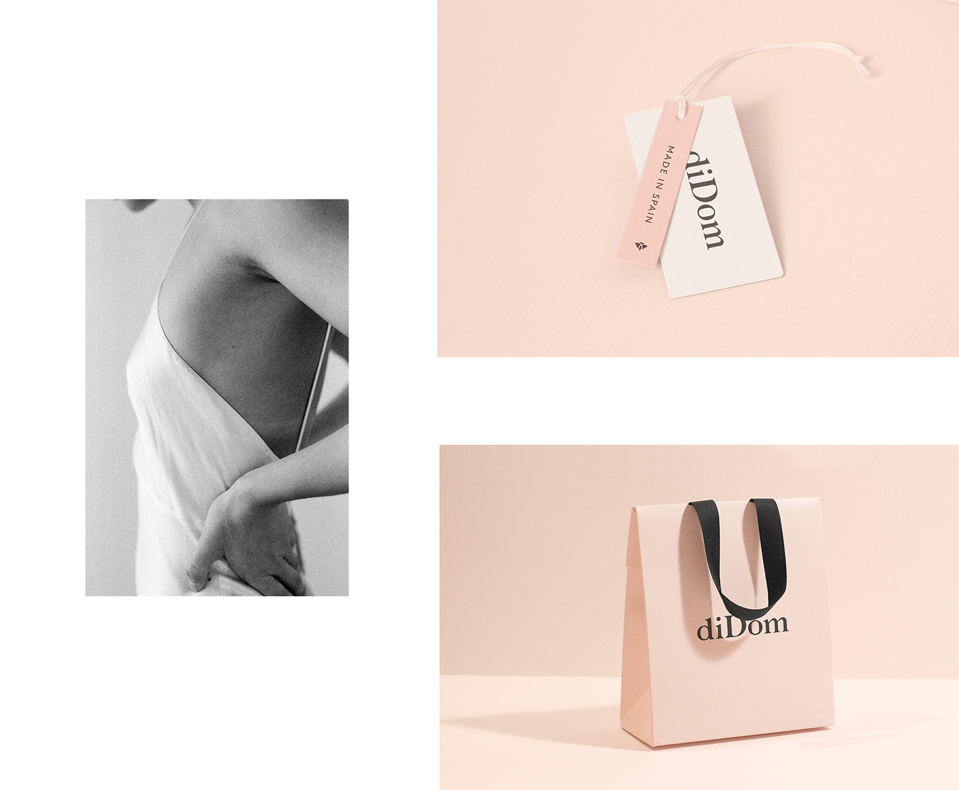
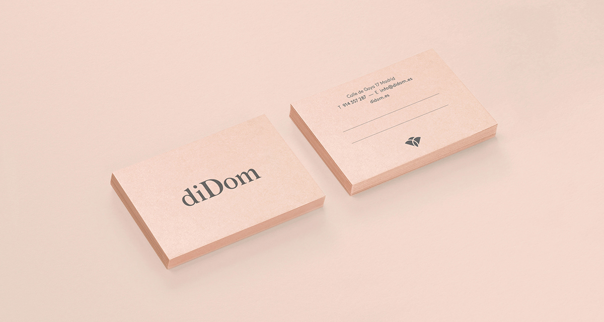
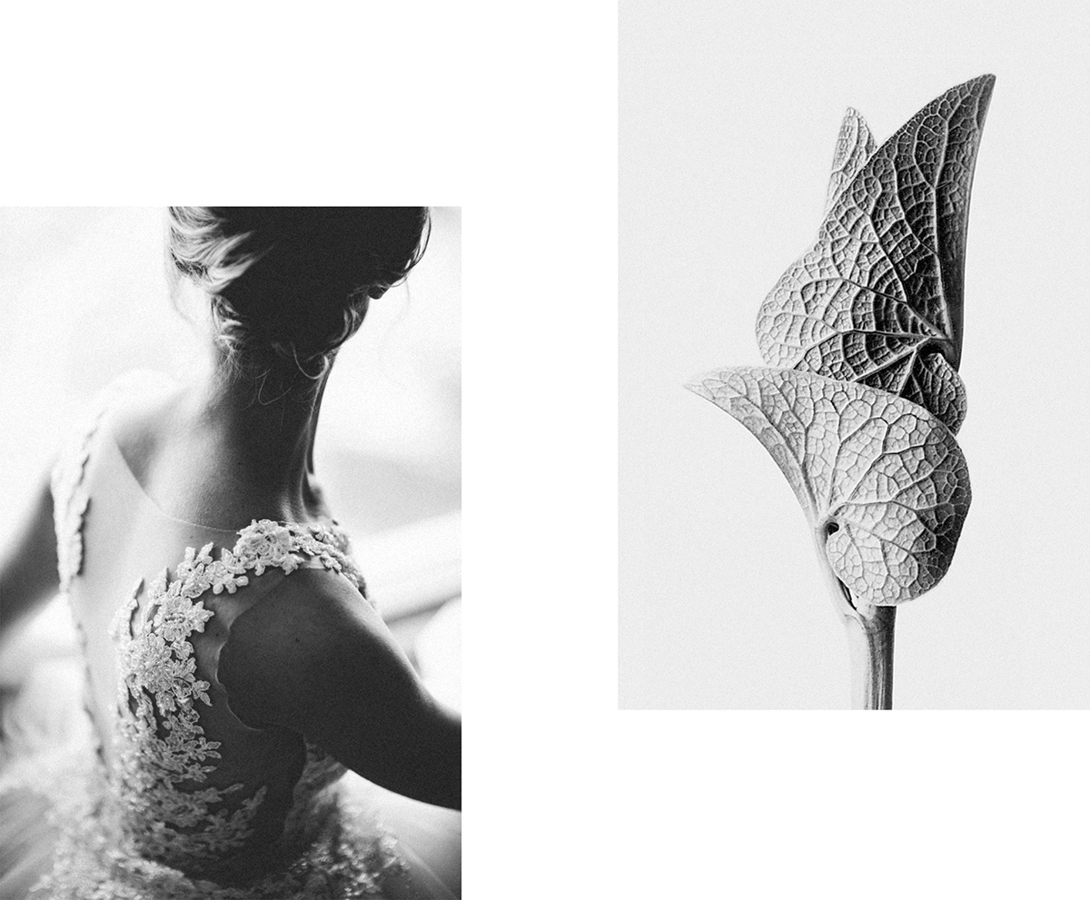
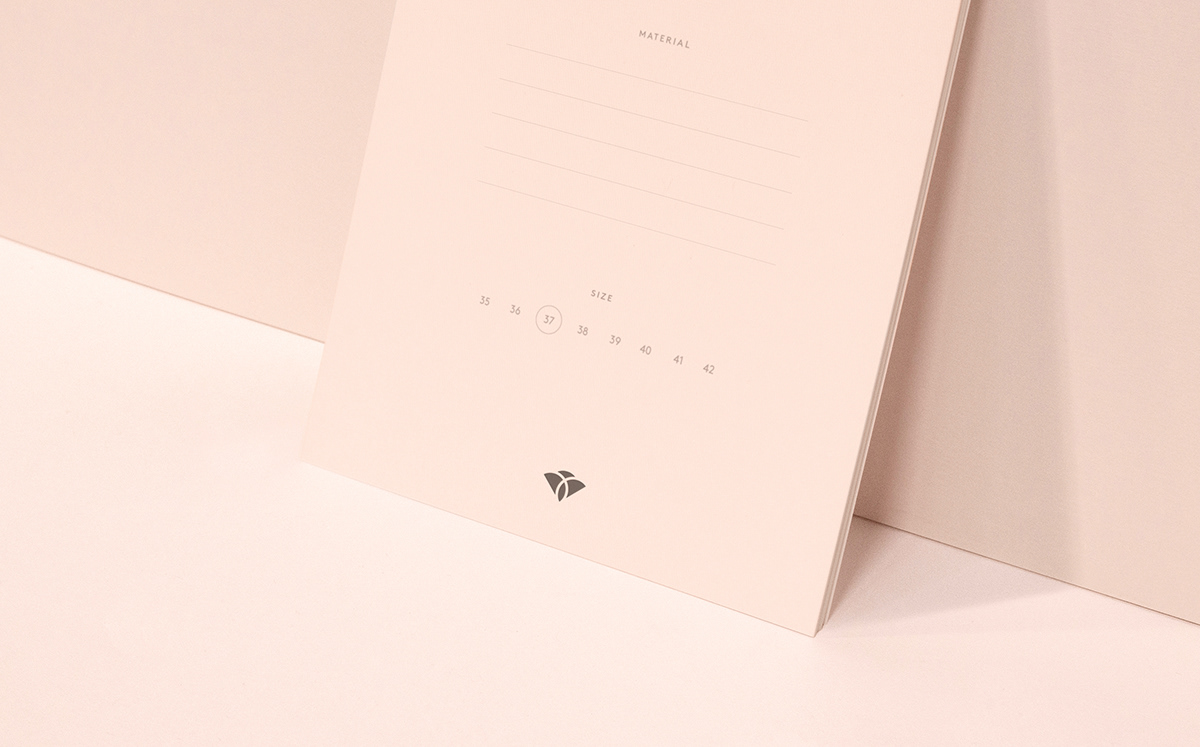
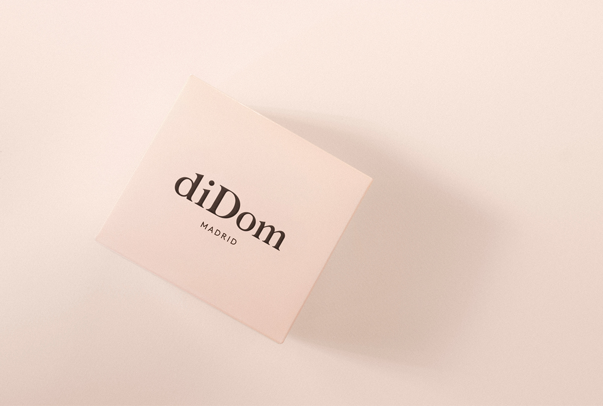
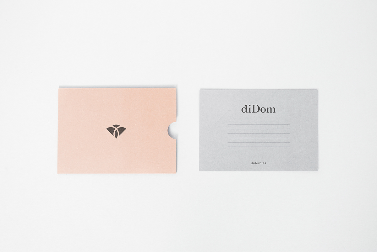
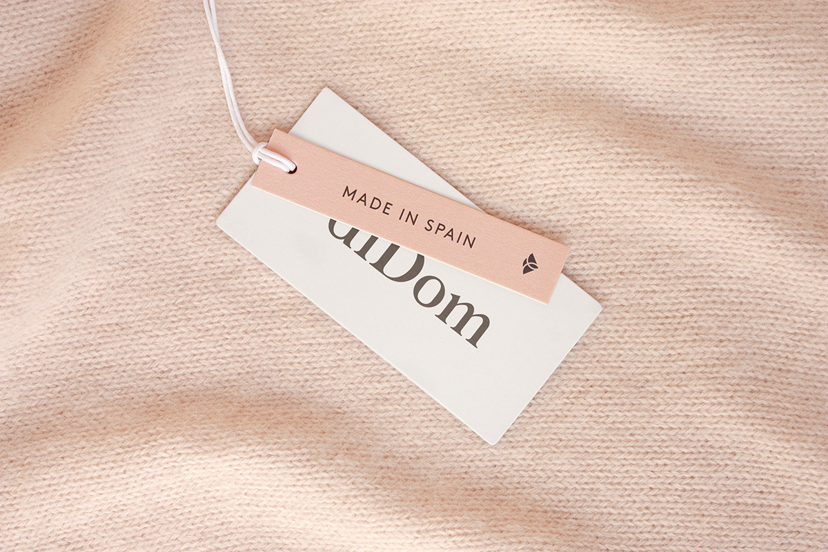
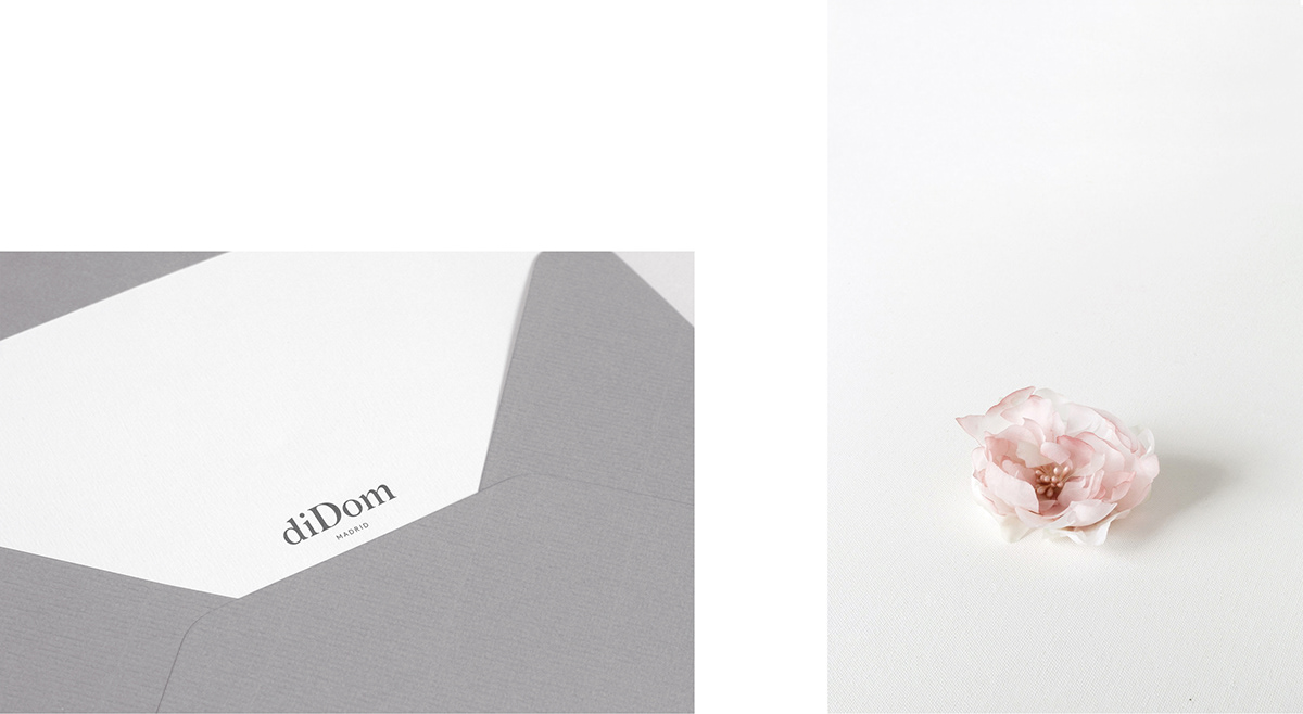
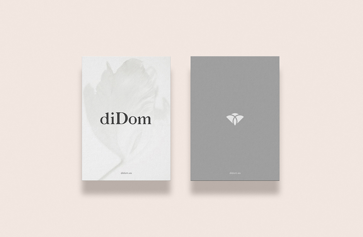
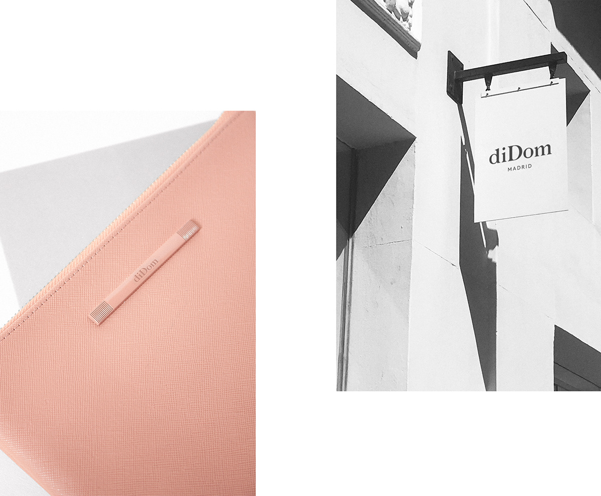
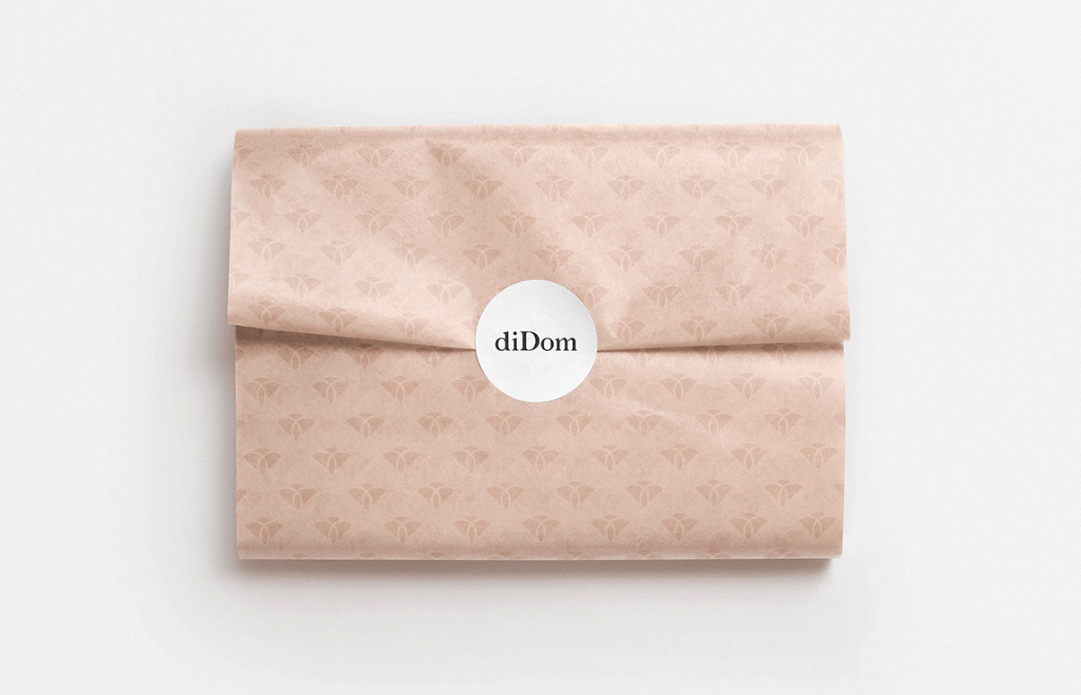
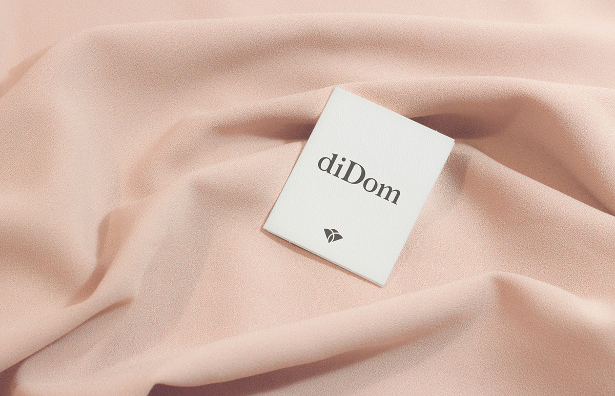
我们想反思一下品牌形象的优雅和精致,以及产品的质量和设计。我们开发了一个定制的.[.].[.[.].]印刷标志和一个偶尔伴随该品牌的符号。这个符号诞生于以品牌名义出现的两个字母D的结合,构筑了一朵花的优雅轮廓,柔和的形状与女性的形式有关,并反映了一些最具代表性的婚礼和庆祝的象征:两个人的结合。我们决定使用软公司颜色的调色板,支持黑色和白色。设计、质量、典雅。
diDom is a store located in the heart of Madrid's Golden Mile with more than 30 years of history, specializing in the sale of shoes and accessories for weddings and celebrations. We were asked to redesign the entire brand to completely change its old-fashioned image and position themselves in today's wedding markets.
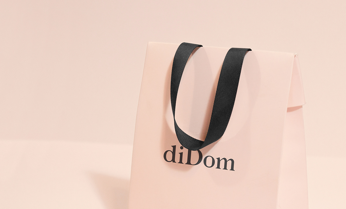
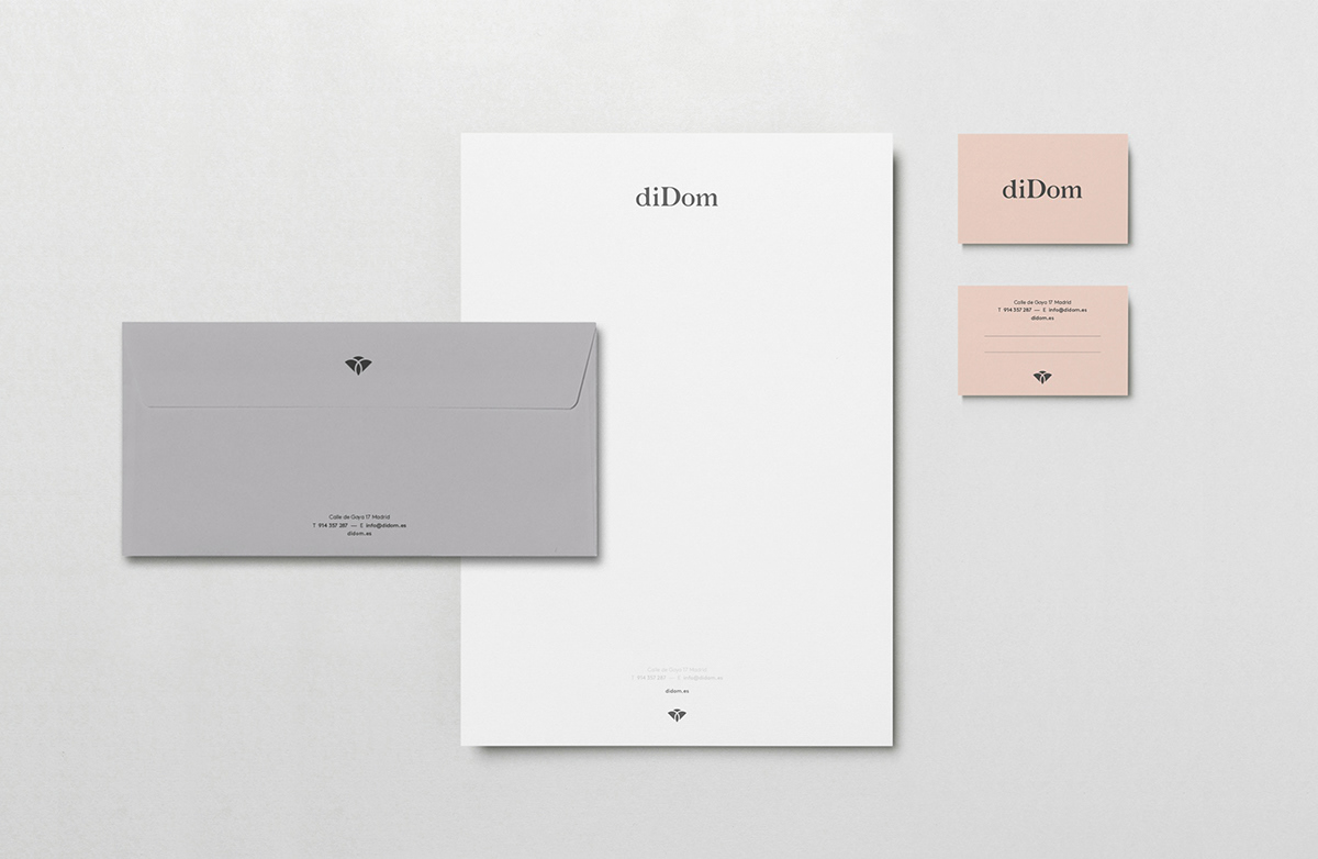
We wanted to reflect on the elegance and delicacy of the brand identity, as well as the quality and design of its products. We have developed a customized typographic logo and a symbol that occasionally accompanies the brand. The symbol was born from the union of the two letters D present in the name of the brand, building the elegant silhouette of a flower, with soft shapes in reference to the forms of women and reflecting some of the most representative emblems of weddings and celebrations: The union of two people. We decided to use a palette of soft corporate colors, supported in black and white. Design, quality and elegance.
请搜索微信公众号:wwwtop0755com,或用微信扫描下面的二维码:

深圳市顶点企业形象策划有限公司 是一家企业VI设计与形象策划的综合服务提供商,我们坚持以创新的思路做品牌,做最有力的“创新型设计”!